Web design is a fascinating and ever-changing topic. Blog and site owners can now shift, change, tweak and perfect their domains – using great online tools and a few tricks. So whether you’re just getting started or looking for a fresh look – check out these 7 timeless online designing tips & tools.
Pick two or three fonts and stick to them
There are thousands of different fonts around the web, just waiting for you to choose them from the crowd. Although most of them are nice and fun, don’t be tempted to fill your blog or site with too many styles. Remember that fonts should be easy to read and compliment your content – so choose two or three font families and stick to them. Fontspace is a cool place for downloading different fonts.
Pro Tip: See something you like but can’t identify it? Try WhatTheFont, it’s like Shazam, but for fonts.
Pick two or three colors and stick to them
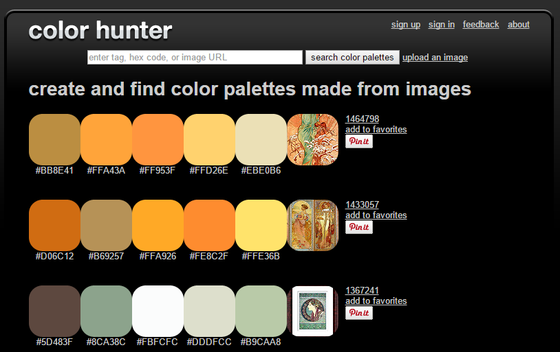
Color choices can really make a difference – they can either grab attention and drive users to engage with your content, or make them run away. Choose a color pallet that compliments your content – whether you want it to appear professional, fun or modern. In addition, sticking to fewer colors through all your different materials can also help your branding efforts.
Pro Tip: Use online tools to upgrade your color game, like Adobe Kuler, Pictaculous or color hunter.

Don’t be afraid of white space
Less is often more – not every pare of the screen needs to be filled with content. White spaces can give your content breathing area, as well as helping you putting emphasis on some of the the more important messages. Remember – overly crowded pages can cause confusion and be overwhelming for the user.
Pro Tip: white spaces can also help users find things more easily!
Don’t be afraid to try new things
Design is a very subjective field – what works for one site might not work for another. Reading and learning about the subject is always important, but you’ll never get to where you want to be without taking the first step. Remember – (almost) everything can be undone, so feel free to experiment with your site’s look & feel.
Pro tip: Don’t just guess, use online a/b testing tools to see which design works for you and your readers. Check out Optimizely testing tool or VWO.
Keep your design up to date
Web design is an ever-changing field. Things that look good today might not be as cool in 6 months. So keep on reading and searching the web for the next great thing.
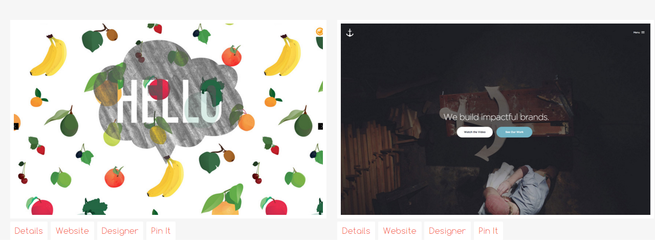
Pro tips: Sites like The Best Design is great for some inspiration.

Invest in good photos
Images are a huge part of any site or blog, so it’s crucial to invest in good material. If you don’t want or need to shoot your own pics, there are plenty of online stock photos libraries, filled with high quality images you can use. Don’t be tempted to borrow or steal other people or company’s photos – it’s not worth it!
Pro tip: Check out PicMonkey, a free online photo editing tool.
Use online tools
There are many great tools & hacks to assist you on the journey for great design. Want to design you own call to action button? Try Da Button Factory. Always wanted to create a beautiful infographics? Check out Piktochart. Canva is a great graphic design tool for creating materials such as Email headers, posters, presentations etc.
Want to learn more? Join the conversation and follow us on Facebook, Twitter, Instagram, Google+, and Pinterest.

