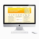
 Landing pages are key for converting qualified leads into clients, so pay close attention to the way that yours are optimized. A simple re-optimization of your landing page with the best SEO practices in mind (e.g. emotional triggers, psychological factors, appeal to algorithms, branding, friction-less content, fluidity, etc.) will produce stunning results with conversion rates that are closer to—or exceeding—your expectations.
5 powerful ways to optimize your landing page for conversions
Here are five optimization strategies for landing pages straight from the pros, that you can implement yourself for higher conversion rates:
-
Rethink Your Call to Action.
We all know that the point of a landing page is to get the lead to follow through on the conversion. You’ve gotten them this far, now the CTA should do the rest of the work, right? Well, the problem is, many landing pages are not direct enough in the CTA. They don’t tell the lead exactly what they should do next. Further, the CTAs aren’t visible enough and don’t invoke the right emotions. So what should you do?
Make your CTA strong and direct. Tell the lead what they need to do right now and what they will get if they do it. Make it short and sweet. Then, create a few of the CTAs. While most landing pages put the CTA at the bottom of the page, conventional wisdom tells us that “above the fold” is better. While this is arguable, why not put a CTA above the fold and one at the bottom? Can’t hurt. Also, make sure your CTAs are large enough to be visible and that they stand out. A button is a great idea, especially if it uses colors to create urgency (red) or emotional triggers (blue is equated to trust).
-
Colors Matter.
The color scheme of your landing page matters more than you might think. Try to have only two to three colors, but make sure they are consistent with any ad that you have leading into the landing page (i.e. make sure the lead knows they are in the right place). Remember that colors trigger emotions and most purchases are made based on emotion. Consider the motivation to buy that your audience has and then either change it up or play into it using colors. Here are some top converting colors and the emotions they trigger for landing pages: Red is excitement, energy, passion, desire and action. Blue is intelligence, trust, serenity, honesty and authority. Green is reassurance, balance, hope, growth and refreshing. Purple is creativity, spirituality, quality, royalty and individuality. Orange is fun, optimism, friendly and uplifting. Yellow is happy, enthusiastic, friendly optimistic and confident.
-
Insert Media.
We all know that pictures and videos are great on social media, so why is it so difficult to think that they wouldn’t be equally effective on landing pages? Because they aren’t—they’re more effective. In fact, according to MDG Advertising, content with images get 94% more views than content without images. Are you willing to roll the dice on that 6% being your exact target demographic? Add relevant pictures and videos to your landing pages. Unfortunately, there is no “one” type of image or video that works best here, it is dependent on what your audience responds to. For this reason, I highly suggest A/B testing your landing pages. Set up two or three landing pages with the same exact content, but with different images. Track them for a few weeks and see which images convert better. Go with those.
-
The Layout.
Landing pages should always be focused on one specific segment of your audience that is ready to convert. This isn’t the place to give them the rundown of your entire operation. This isn’t the place to talk about how and where the product was developed. This is the place to close the sale. You have the lead there; get them to do what you want as quickly as possible. This means keeping the layout flowing to reduce friction as much as possible. Short content works best here. Keep the sentences short, the paragraphs shorter and use subtitles. Let the viewer decide if they want to read more or how much they actually need to read before buying. No links out to other pages, no flashy, distracting content that doesn’t directly drive the sale—the less friction you have on the way to the CTA, the higher your conversion rate is going to be. Don’t give them any other options other than following through on your desires via the CTA button.
-
Be Explosive.
Some of the best landing pages out there are the most explosive in their approach. For instance, QuickSprout is great with their pop-up landing pages asking, “Do you want more traffic?” You can either click “Yes, I want more traffic” or “No, traffic and sales isn’t important to me.” That click where you opt-out really makes you think—of course traffic and sales are important to you! So the next time you see that, you might click on the “yes” button. The point here is that the more explosive and attention grabbing your content is, the more likely you will actually jar your viewer into action. This is great to quickly grab the qualified leads who are ready to buy, but also to gently nudge those fence-sitters down into your sales funnel. While it won’t always pan out, even if you get 50% of the fence-sitters to convert, it’s better than the 0% you had before you nudged them down from their indecisive station.
Of course, as mentioned above with images, A/B testing is vital not just for videos and pictures, but for every aspect of your landing page. Being able to pivot in real-time is vital for the success of any landing page, so analytics, testing and reiteration become extremely important in today’s landing page-rich internet.
Author Bio – This guest article is a work of Sameer Panjwani, founder of Mondovo, an all-in-one tool to gain useful insight to your website’s SEO, Social & Analytical aspects.
What do you think? Share your thoughts with us on Facebook, Twitter, and Google+.

